I wrote my first script on a Compaq Presario in 1997. It let you add two numbers, was written in BASIC, and no matter what you tried to add the result was always 80085 because I was 13.
I've come a long way since then. For the past 13 years, I have worked professionally as a full-stack developer. I do both front-end and back-end web development, mobile development, and software architecture. I primarily work in Ruby and Javascript, and these days my focus is on React and React Native.
Full-Stack Developer from Miami Raleigh
Hi there, my name is Orlando de Frias, and I write software.
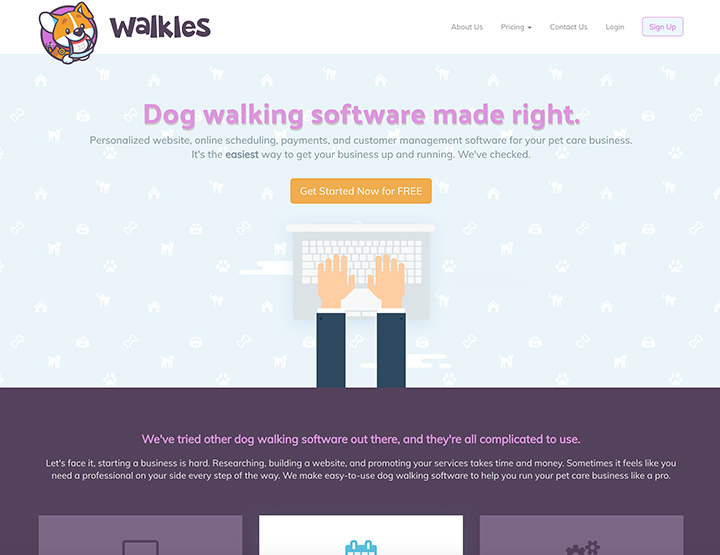
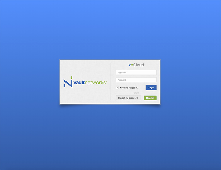
Some of My Work
Take a look at some of the projects I've worked on.